
How we built our interactive demo walk-through
This is a walk-through of how we built the interactive demo on our landing page.
It was initially intended as a morning hack project, just to show the team a concept, but we ended up using it. The idea was to give visitors to our website a feel for what Trevor.io does, without them having to sign up.
In case you missed it, here it is:

Building it took just a couple of hours, but has had a hugely positive impact on our conversion rate (you can see it on our landing page here). And we didn't use any special tool to build it. We built it from scratch using plain, vanilla jQuery.
So, for anyone who wants to build their own interactive demo, we’ve created this step-by-step guide for you. If you’d rather just grab the code, that’s cool too - we’ve included it at the end of this article.
Below we will take you through how we gradually built up the HTML, CSS and Javascript that creates this demo. We hope you find that helpful. Any questions/comments/feedback, please let us know at the bottom of this article.
Step 1: Collect the imagesStep 2: Loop the images
Step 3: Add the circle
Step 4: Move the circle
Step 5: Add labels
Step 6: Make the circles pulsate
Step 7: Draw attention
Step 8: Zoom on mobile
Step 9: Finishing touches
The full code
Let's jump straight in:
Step 1: Collect the images
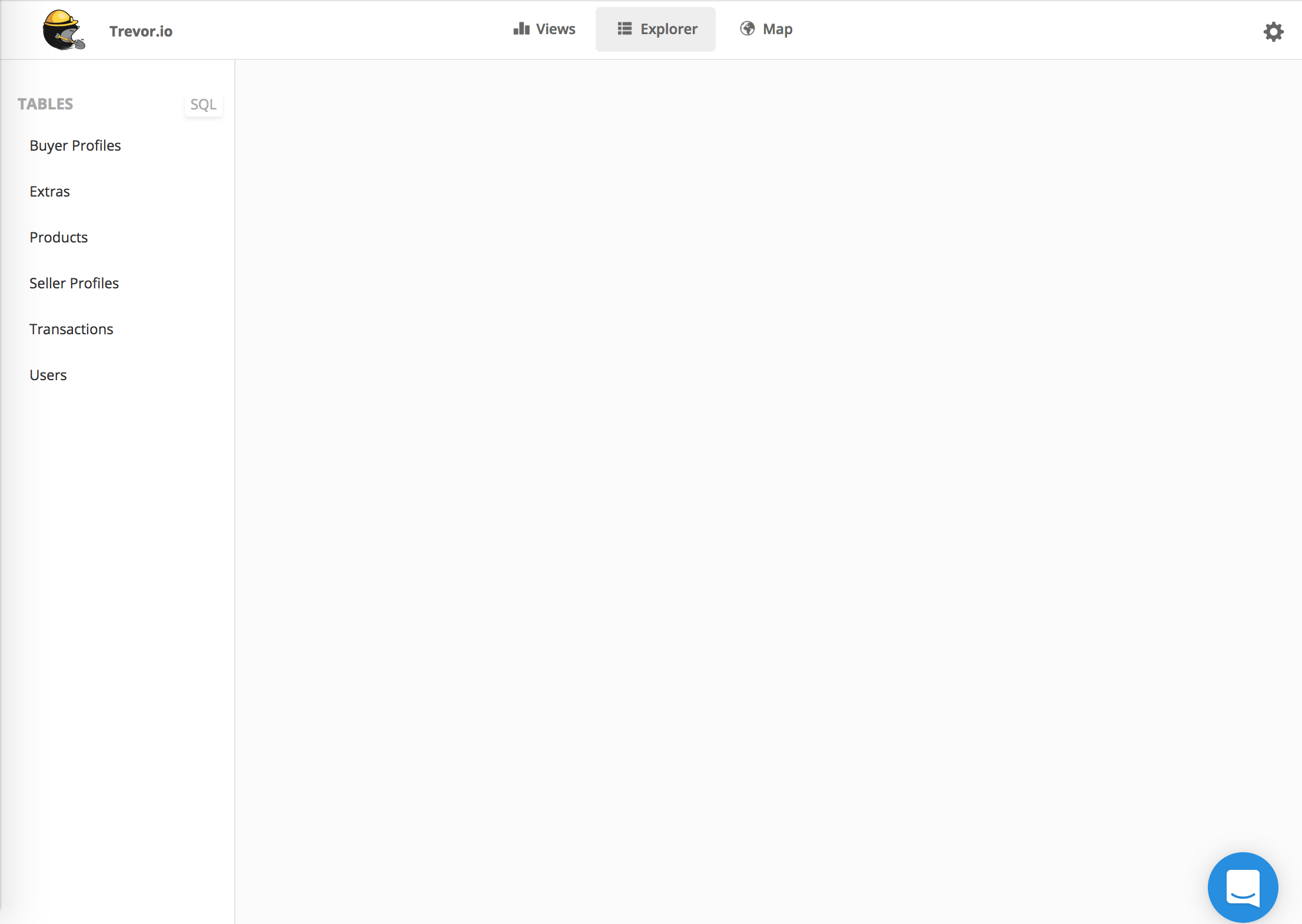
The first thing we needed was the list of images that make up the interactive demo. We simply used the built-in screenshot tool on Mac (Shift+Cmd+4) to take snapshots of each step in the walk-through.
To make sure the images weren't too big (in bytes) we used a compression tool (this one) to shrink them.
Click the image below to loop through and see the images we used.

Step 2: Loop the images
The above is actually a really nice starting point for creating our interactive demo. So let's start with that: a little bit of HTML, Javascript and CSS that when we click on an image it jumps to the next image.
The HTML we need is simple. Just an image (i.e. img tag) wrapped in a div:
<div class="demo-container">
	<img class='screenshot' src='/img/flow/click-users.png'/>
</div>
We wrap the image in the div because we will be adding more content to the div later. We then use some CSS to make the image take the full-width of its container.
.demo-container img {
    width: 100%;
}
This is so you can always see the full image inside the container (even if the container is resized).
We then include some javascript to hold the list of images:
var steps = [
	'/img/flow/click-users.png',
	'/img/flow/click-header.png',
	'/img/flow/click-count-by.png',
	'/img/flow/click-table-tab.png',
	'/img/flow/click-share.png',
	'/img/flow/click-google-sheets.png',
	'/img/flow/google-sheets.png' ];
And we use jQuery to add a click handler to the image itself (the yellow highlighted section below is the code we have added):
var steps = [
	'/img/flow/click-users.png',
	'/img/flow/click-header.png',
	'/img/flow/click-count-by.png',
	'/img/flow/click-table-tab.png',
	'/img/flow/click-share.png',
	'/img/flow/click-google-sheets.png',
	'/img/flow/google-sheets.png' ];

var step = 0;

$('.screenshot').click(function() {
	// increment step
	step = (step + 1) % steps.length;
	// update visible image
	var image = steps[step];
	$('.screenshot').attr('src', image);
})
This click handler $('.screenshot').click(...) moves us to the next step (i.e. shows the next image) every time it is clicked.
We have added % steps.length to the end of (step + 1) in order to have the images loop back around once we've been through all of them (i.e. after the 6th step it will loop back around to the 0th).
And $('.screenshot').attr('src', image) updates the src attribute on the img tag with the next image.
Step 3: Add the circle
The next thing we want to add is the clickable circle.

To do this we need to add a div to our HTML to represent our circle.
<div class="demo-container">
	<div class="circle"></div>
	<img class='screenshot' src='/img/flow/click-users.png'/>
</div>
We then use some CSS to style it:
.demo-container img {
    width: 100%;
}

.circle {
  border: solid 4px #d87070;
  cursor: pointer;
  position: absolute;
}

.demo-container {
	position: relative;
}
First thing we have done is add a red border to the circle class. This is why the circle appears red.
We have then set the cursor as a pointer so that when your mouse hovers over it it is clearly clickable.
And finally we have set the position attribute on both the circle and its container. We do this because we want the circle to be positioned relative to its container.
Absolute positioning (i.e. position: absolute;) positions an element relative to its nearest positioned ancestor. Therefore, to position the circle relative to its container, we give the circle position: absolute; but we must also give the container position: relative; (so that the container is considered a positioned ancestor).
Applying the CSS and HTML above will give us a red square (because divs are rectangular by default). To turn the square into a circle we can use CSS to give it a border-radius equal to half its width. This will make it appear round.
This is exactly what we will do, however we will do it using jQuery:
var steps = [
	'/img/flow/click-users.png',
	'/img/flow/click-header.png',
	'/img/flow/click-count-by.png',
	'/img/flow/click-table-tab.png',
	'/img/flow/click-share.png',
	'/img/flow/click-google-sheets.png',
	'/img/flow/google-sheets.png' ];

var step = 0;

var radius = 40; // this is the radius of the circle (in pixels)
$('.circle').css({
	top: $('.demo-container').height() / 2 - radius, //put centre of circle in middle
	left: $('.demo-container').width() / 2 - radius, //put centre of circle in middle
	width: radius * 2,
	height: radius * 2,
	borderRadius: radius // this is what makes it a circle (as opposed to a square)
})

//make circle clickable
$('.circle').click(function() {
	step = step + 1 % steps.length;
	var image = steps[step];
	$('.screenshot').attr('src', image);
})
Here you can see we have used $('.circle').css(...) to apply additional CSS to the circle. The reason we do this using javascript is so that we can dynamically update the size (i.e. radius) and position of the circle later.
The width, height and borderRadius properties set the size of the circle. And top and left set the position of the circle. You can see we have used the height and width of the container in order to position the circle in the middle of the image (if you resize your browser you will see that the circle stays in the middle).
You will also notice that we have changed the .click(...) handler to be applied to the circle, rather than the image.
The result is as shown earlier:

Step 4: Move the circle
Our next step is to position the circle in the right position for each image.
Click the circles below to see what I mean:

This requires a little bit of manual work from our part, and obviously the positions for your interactive demo (if you are building your own) will be different from ours.
A slight complication comes in because we want our interactive demo to work even at different screen sizes. In other words, no matter whether we're viewing the demo on a large widescreen display or on mobile, we still want the circles to appear at the right locations on the image.
E.g. if our first circle should be positioned at [12,200] when the demo is 1200px wide, then it should be positioned at [6,100] when the demo is 600px
To achieve this we do two things.
1. we make a list of all the coordinates for our circles:
var steps = [
	['/img/flow/click-users.png', [1, 280]],
	['/img/flow/click-header.png', [765, 155]],
	['/img/flow/click-count-by.png', [777, 257]],
	['/img/flow/click-table-tab.png', [572, 202]],
	['/img/flow/click-share.png', [722, 149]],
	['/img/flow/click-google-sheets.png', [773, 266]],
	['/img/flow/google-sheets.png', [54, -14]]
];
Note: if you're not sure what your coordinates should be, just randomly give them some values, and then manually adjust them until they're in the right positions.
And then 2., we write a small function (we named it adjusted), which takes a length (or coordinate) and scales it to the current screenshot height:
/*
 * given a length (measured using original demo height of 785px)
 * return an adjusted length based on current demo height.
 */
function adjusted(length) {
	var originalHeight = 785;
	var currentHeight = $('.screenshot').height();
	var ratio = currentHeight / originalHeight;
	return length * ratio;
}
This just performs a bit of basic arithmetic to scale the given length. Completely arbitrarily, we calculated all the coordinates (i.e. x,y pixel positions) for our circles using the assumption that the images were all 785px tall (even though they are not). It doesn't actually matter what originalHeight you use, as long as the coordinates for your circles are accurate relative to that.
So putting it all together:
var steps = [
	['/img/flow/click-users.png', [1, 280]],
	['/img/flow/click-header.png', [765, 155]],
	['/img/flow/click-count-by.png', [777, 257]],
	['/img/flow/click-table-tab.png', [572, 202]],
	['/img/flow/click-share.png', [722, 149]],
	['/img/flow/click-google-sheets.png', [773, 266]],
	['/img/flow/google-sheets.png', [54, -14]]
];

var step = 0;

// adjust the coordinates to match the actual height of the image
function adjusted(length) {
	var originalHeight = 785; // the coordinates above were calculated assuming an arbitrary image height of 785px
	var currentHeight = $('.screenshot').height();
	var ratio = currentHeight / originalHeight;
	return length * ratio;
}

var radius = adjusted(40);

function updateCircle() {
	var coordinates = steps[step][1];
	$('.circle').css({
		top: adjusted(coordinates[1]), // use the coordinates to position the circle
		left: adjusted(coordinates[0]), // use the coordinates to position the circle
		width: radius * 2,
		height: radius * 2,
		borderRadius: radius
	})
}

updateCircle(); //init circle at beginning of demo

$('.circle').click(function() {
	step = (step + 1) % steps.length;
	var image = steps[step][0]; //image is 0th item in array
	$('.screenshot').attr('src', image);
	updateCircle();
})
You can see that we have added the adjusted function and we have used it to adjust not only our positions (top and left) but also our circle radius. This means that the circle size also stays consistent with respect to the image size.
We have then wrapped our circle CSS logic in an updateCircle function. This is because we no longer just set the circle size and position once. We want to update it every time the user clicks a circle.
And finally we make sure to call updateCircle() straight away in order to initialise the circle in the correct starting position.
Step 5: Add labels
Our circles are now moving around as we hoped, but we also want to add instructional labels to them.
You can see what that looks like here:

The labels are just a div that sits alongside the circle with a short instructional message.
We place it inside the circle div, as we know we always want it positioned relative to the circle itself:
<div class="demo-container">
	<div class="circle">
		<div class="circle-label">this is a label</div>
	</div>
	<img class='screenshot' src='/img/flow/click-users.png'/>
</div>
Here is the new CSS:
.demo-container img {
    width: 100%;
}

.circle {
  border: solid 4px #d87070;
  cursor: pointer;
  position: absolute;
}

.demo-container {
	position: relative;
}

.circle-label {
	/* position relative to its ancestor (the circle) */
    position: absolute;

    /* provide some visual styling */
    text-align: center;
    font-weight: 600;
    background-color: #222;
    color: #fff;
    padding: 10px;
    width: 135px;
    border-radius: 5px;
}
We use position: absolute; again for the .circle-label so that the label can be positioned relative to its ancestor (the circle) using the top and left CSS attributes (which we will apply using jQuery in a moment).
Using this CSS we now have a styled black box sitting on top of the circle.

All we need to do is use some javascript to update that box with the relevant label text, and to move it down and right a little, so it sits just outside the circle:
var steps = [
	['/img/flow/click-users.png', [1, 280], 'Start by choosing the database table you want to view'],
	['/img/flow/click-header.png', [765, 155], 'Click a column header to start building your query'],
	['/img/flow/click-count-by.png', [777, 257], "Let's GROUP users BY country"],
	['/img/flow/click-table-tab.png', [572, 202], 'You can see the results as a chart or a data table'],
	['/img/flow/click-share.png', [722, 149], "Let's export these results"],
	['/img/flow/click-google-sheets.png', [773, 266], 'Live-stream the results into Google Sheets'],
	['/img/flow/google-sheets.png', [54, -14], 'Back to Trevor'],
];

var step = 0;

function adjusted(length) {
	var originalHeight = 785;
	var currentHeight = $('.screenshot').height();
	var ratio = currentHeight / originalHeight;
	return length * ratio;
}

var radius = adjusted(40);

function updateCircle() {
	var coordinates = steps[step][1];
	$('.circle').css({
		top: adjusted(coordinates[1]),
		left: adjusted(coordinates[0]),
		width: radius * 2,
		height: radius * 2,
		borderRadius: radius
	})
	//update the labels
	var labelText = steps[step][2];
	$('.circle-label')
		.text(labelText)
		.css({
			top: radius * 1.8,
			left: radius * 1.8
		});
}

updateCircle();

$('.circle').click(function() {
	step = (step + 1) % steps.length;
	var image = steps[step][0];
	$('.screenshot').attr('src', image);
	updateCircle();
})
As you can see, we have included the label text in our steps array.
And we use $('.circle-label').text(...) to set the box's text.
We then apply radius * 1.8 to both top and left in order to push the label outside the circle.
The result is as shown earlier:

Step 6: Make the circles pulsate
Now for the fun stuff. Let's make the circles pulsate:

We can do this using jQuery animations.
Specifically $('.circle').animate(...) which works exactly like $('.circle').css(...) except that it doesn't just update the CSS properties. It animates the transition from the current values to the next.
So what we will do to make the circle pulsate, is to:
- increase the circle's radius a little using an animation.
- And then instantly reduce the circle's radius again.
Thus creating a pulsating effect.
Here is the code:
...

function animateCircle(circleRadius, ms, cb) {
	var coordinates = steps[step][1];
	$('.circle')
		.animate({
			top: adjusted(coordinates[1]),
			left: adjusted(coordinates[0]),
			width: circleRadius * 2,
			height: circleRadius * 2,
			borderRadius: circleRadius
	}, {
		complete: cb,
		duration: ms
	});
}

...

//pulsate
var interval = setInterval(function() {
	animateCircle(radius+adjusted(20), 200, function() { //grow the circle
		animateCircle(radius, 200) //shrink the circle
	})
}, 1500);

...
We have added an animateCircle function that animates the resizing of the circle. It takes 3 parameters: circleRadius, ms and cb:
- circleRadius is the new circle radius that we want the circle to change to (at the end of the animation).
- ms is the duration in milliseconds that the animation should take (0 being instant and 2000 being 2 seconds).
- And cb is a callback function that will be called once the animation is complete. This allows us to chain animations (i.e. have another begin after the first is finished).
We have then added a setInterval(..., 1500) section to create a loop that makes the pulsate animation happen every 1.5 seconds.
This loop calls the animateCircle function to grow the circle, and passes in a callback function that then shrinks the circle again directly after the growing part has completed.
Beautiful!
Take a second to understand how the pulsate loop works as we will use this technique for some of the other animations.
Ok, let's tidy up a little before we move on. If you look at the first few lines of updateCircle below, you will notice that it's effectively doing the same as animateCircle except using $.css(...) instead of $.animate(...).
...

function animateCircle(circleRadius, ms, cb) {
	var coordinates = steps[step][1];
	$('.circle').animate({
			top: adjusted(coordinates[1]),
			left: adjusted(coordinates[0]),
			width: circleRadius * 2,
			height: circleRadius * 2,
			borderRadius: circleRadius
	}, {
...

function updateCircle() {
	var coordinates = steps[step][1];
	$('.circle').css({
		top: adjusted(coordinates[1]),
		left: adjusted(coordinates[0]),
		width: radius * 2,
		height: radius * 2,
		borderRadius: radius
	})
...
Let's clean this up by replacing our $('.circle').css(...) call inside updateCircle with a call to animateCircle:
var steps = [
	['/img/flow/click-users.png', [1, 280], 'Start by choosing the database table you want to view'],
	['/img/flow/click-header.png', [765, 155], 'Click a column header to start building your query'],
	['/img/flow/click-count-by.png', [777, 257], "Let's GROUP users BY country"],
	['/img/flow/click-table-tab.png', [572, 202], 'You can see the results as a chart or a data table'],
	['/img/flow/click-share.png', [722, 149], "Let's export these results"],
	['/img/flow/click-google-sheets.png', [773, 266], 'Live-stream the results into Google Sheets'],
	['/img/flow/google-sheets.png', [54, -14], 'Back to Trevor'],
];

var step = 0;

function adjusted(length) {
	var originalHeight = 785;
	var currentHeight = $('.screenshot').height();
	var ratio = currentHeight / originalHeight;
	return length * ratio;
}

var radius = adjusted(40);

function animateCircle(circleRadius, ms, cb) {
	var coordinates = steps[step][1];
	$('.circle')
		.animate({
			top: adjusted(coordinates[1]),
			left: adjusted(coordinates[0]),
			width: circleRadius * 2,
			height: circleRadius * 2,
			borderRadius: circleRadius
	}, {
		complete: cb,
		duration: ms
	});
}

function updateCircle() {
	var coordinates = steps[step][1];
	$('.circle').css({
		top: adjusted(coordinates[1]),
		left: adjusted(coordinates[0]),
		width: radius * 2,
		height: radius * 2,
		borderRadius: radius
	})
	animateCircle(radius, 0);//move circle to new location
	var labelText = steps[step][2];
	$('.circle-label')
		.text(labelText)
		.css({
			top: radius * 1.8,
			left: radius * 1.8
		});
}

//pulsate
var interval = setInterval(function() {
	animateCircle(radius+adjusted(20), 200, function() {
		animateCircle(radius, 200)
	})
}, 1500);

updateCircle();

$('.circle').click(function() {
	step = (step + 1) % steps.length;
	var image = steps[step][0];
	$('.screenshot').attr('src', image);
	updateCircle();
})
Notice we've set the ms duration to 0. This is so the update effectively happens instantly (without an animation).
The pulsate should now work.... however, there is a problem:

It turns out that jQuery sets overflow: hidden; on the circle when animating it, causing the label to disappear. Not good.
Let's quick-fix (...hack) that:
function animateCircle(circleRadius, ms, cb) {
	var coordinates = steps[step][1];
	$('.circle')
		.animate({
			top: adjusted(coordinates[1]),
			left: adjusted(coordinates[0]),
			width: circleRadius * 2,
			height: circleRadius * 2,
			borderRadius: circleRadius
	}, {
		complete: cb,
		duration: ms,
		step: function() {
			// jquery.animate sets overflow: hidden during animation, so
			// need to override that (otherwise label disappears)
			$('.circle').css("overflow","visible");
		 }
	});
}
We have added a step parameter to jQuery's animate function which effectively overrides the default overflow behaviour.
Ok, that's better:

But now there's a new problem. The circle seems to be expanding out to the right, rather than pulsating on the spot. This is because, while we are making the circle grow, the top left position of the circle is staying static in place.
What we need is for the circle to move up and left at the same pace as it grows, in order to give the visual impression that the circle is pulsating on the spot.
This is actually relatively easily done:
function animateCircle(circleRadius, ms, cb) {
	var coordinates = steps[step][1];
	$('.circle')
		.animate({
			top: adjusted(coordinates[1])  - (circleRadius - radius),
			left: adjusted(coordinates[0])  - (circleRadius - radius),
			width: circleRadius * 2,
			height: circleRadius * 2,
			borderRadius: circleRadius
	}, {
		complete: cb,
		duration: ms,
		step: function() {
			// jquery.animate sets overflow: hidden during animation, so
			// need to override that (otherwise label disappears)
			$('.circle').css("overflow","visible");
		 }
	});
}
We just adjust the top and left coordinates of the circle by the difference between the original circle radius and its new radius.
Right, let's see if that worked:

It definitely worked... the circle is in the right position. But now the label is rocking back and forth. Why does it do that?
It does that because the label is relative to the circle, and when the circle moves its position up and left it takes the label with it.
So... at this point, a better man than me might say "Having the label relative to the circle was just a silly idea! It's causing lots of problems. Let's go back and change that.".
But ... I am not that man :) So, like a trooper, I powered onwards.
If the problem is that the circle is being shifted up and left, let's just have the label simultaneously shift down and right. That will have the effect of keeping it in place (...genius!).
Here's the code:
...

function animateCircle(circleRadius, ms, cb) {
	var coordinates = steps[step][1];
	$('.circle')
		.animate({
			top: adjusted(coordinates[1]) - (circleRadius - radius),
			left: adjusted(coordinates[0]) - (circleRadius - radius),
			width: circleRadius * 2,
			height: circleRadius * 2,
			borderRadius: circleRadius
	}, {
		complete: cb,
		duration: ms,
		step: function() {
			//jquery.animate sets overflow: hidden during animation, so need to override that (otherwise label disappears)
			$('.circle').css("overflow","visible");
		 }
	});
	var labelText = steps[step][2];
	$('.circle-label')
		.text(labelText)
		.animate({
			top: radius * 1.8 + (circleRadius - radius), // move in opposite direction to circle
			left: radius * 1.8 + (circleRadius - radius) // move in opposite direction to circle
		}, {
			duration: ms
		});
}

function updateCircle() {
	animateCircle(radius, 0);
	var labelText = steps[step][2];
	$('.circle-label')
		.text(labelText)
		.css({
			top: radius * 1.8,
			left: radius * 1.8
		});
}

...
What we've done is to move the label position logic from updateCircle into the animateCircle function. And then we changed it to be an animation ($(...).animate(...) instead of $(...).css(...)).
We have then used + (circleRadius - radius) to move the label in the opposite direction to the circle during the pulsate.
The result is that the label stays exactly where we want it:

Nice!
Step 7: Draw attention
The very last thing we want to do with the circle, is to have it shrink from big to small when you click on it. This is to really draw the attention of the eye to the circle.
Click the circles below to see what I mean:

Ok, to achieve this, we need a couple of things to happen when the user clicks a circle:
- We want the pulsating to stop temporarily (so it doesn't interfere with the animation).
- We want to make the circle really really big.
- We then want to animate the circle getting small again.
- And then we want the pulsating to continue.
Let's do exactly that:
function updateCircle() {
	animateCircle(radius, 0);
	stopPulsate(); // 1. stop pulsating temporarily
	animateCircle(adjusted(2000), 0/*ms*/, function() { // 2. make circle big
		animateCircle(radius, 750/*ms*/, function() { // 3. animate it shrinking
			startPulsate(); // 4. start pulsating again
		})
	})
}

var interval = null;

function startPulsate() {
	interval = setInterval(function() {
		animateCircle(radius+adjusted(20), 200, function() {
			animateCircle(radius, 200) //
		})
	}, 1500);
}

function stopPulsate() {
	clearInterval(interval);
}

updateCircle();

$('.circle').click(function() {
	step = (step + 1) % steps.length;
	var image = steps[step][0];
	$('.screenshot').attr('src', image);
	updateCircle();
})
You can see we have wrapped the pulsate logic in a startPulsate function. And we have created a stopPulsate function to do the opposite.
We have then changed the updateCircle function to do all the 4 steps that we described a moment ago.
Let's see how that looks now (click the circles to see the effect):

Great! The circle animates nicely. The label, however, doesn't move around so smoothly.
What we really want is for the label to swoop in with the circle.
As a very last thing - let's make that happen.
To achieve this, what we need is for the label to stick to the top-left corner of the big circle, while it is shrinking. This will give the visual impression that it is swooping in with the circle. Currently, inside animateCircle we position the label based on the radius of the circle. This keeps it outside the circle. So we don't want it to do this while the big circle is shrinking.
We'll fix this using a boolean flag on animateCircle:
var steps = [
	['/img/flow/click-users.png', [1, 280], 'Start by choosing the database table you want to view'],
	['/img/flow/click-header.png', [765, 155], 'Click a column header to start building your query'],
	['/img/flow/click-count-by.png', [777, 257], "Let's GROUP users BY country"],
	['/img/flow/click-table-tab.png', [572, 202], 'You can see the results as a chart or a data table'],
	['/img/flow/click-share.png', [722, 149], "Let's export these results"],
	['/img/flow/click-google-sheets.png', [773, 266], 'Live-stream the results into Google Sheets'],
	['/img/flow/google-sheets.png', [54, -14], 'Back to Trevor'],
];

var step = 0;

function adjusted(length) {
	var originalHeight = 785;
	var currentHeight = $('.screenshot').height();
	var ratio = currentHeight / originalHeight;
	return length * ratio;
}

var radius = adjusted(40);

function animateCircle(circleRadius, ms, animateLabel, cb) {
	var coordinates = steps[step][1];
	$('.circle')
		.animate({
			top: adjusted(coordinates[1]) - (circleRadius - radius),
			left: adjusted(coordinates[0]) - (circleRadius - radius),
			width: circleRadius * 2,
			height: circleRadius * 2,
			borderRadius: circleRadius
	}, {
		complete: cb,
		duration: ms,
		step: function() {
			//jquery.animate sets overflow: hidden during animation, so need to override that (otherwise label disappears)
			$('.circle').css("overflow","visible");
		 }
	});
	var labelText = steps[step][2];
	if(animateLabel) { //when the big circle shrinks, we want the label to swoop in with it
		$('.circle-label')
			.text(labelText)
			.animate({
				top: radius * 1.8 + (circleRadius - radius),
				left: radius * 1.8 + (circleRadius - radius)
			}, {
				duration: ms
			});
	}
}

function updateCircle() {
	stopPulsate();
	animateCircle(adjusted(2000), 0, false, function() { // don't re-position label
		animateCircle(radius, 750, true, function() {
			startPulsate();
		})
	})
}

var interval = null;

function startPulsate() {
	interval = setInterval(function() {
		animateCircle(radius+adjusted(20), 200, true, function() {
			animateCircle(radius, 200, true)
		})
	}, 1500);
}

function stopPulsate() {
	clearInterval(interval);
}

updateCircle();

$('.circle').click(function() {
	step = (step + 1) % steps.length;
	var image = steps[step][0];
	$('.screenshot').attr('src', image);
	updateCircle();
})
The end result is that the label comes swooping in with the circle. Click the circle below to see this in action:

Phew! It's looking good.
On desktop browsers this is exactly what we wanted.
But now, to make it fully accessible, what about mobile?
Step 8: Zoom on mobile
On mobile the screen size is much smaller, so fitting the whole image on the screen isn't an option. Instead what we can do is have our interactive demo zoom in to the relevant parts, but during major transitions, zoom out to see the full view.
Click below to see this in action:

This is a little tricky, so let's take it step-by-step.
First thing we need to do is wrap our image in an image-holder div:
<div class="demo-container">
	<div class="image-holder">
		<div class="circle">
			<div class="circle-label">this is a label</div>
		</div>
		<img class='screenshot' src='/img/flow/click-users.png'/>
	</div>
</div>
This allows us to perform the zoom by resizing this div and moving it around. Think of the demo-container div as a window looking in on the demo. E.g. to give the impression of zooming in, we just enlarge the image-holder and position it so that the section we want to focus on is visible within the demo-container window. We then hide any overflow so that only what can be seen through the window is visible.
We hide the overflow using CSS:
.demo-container {
	...
	overflow: hidden;
}

.image-holder {
	position-relative;
}
Ok, so just to re-iterate the effect we're trying to achieve: When the user clicks the circle:
- First we hide the circle.
- Then we want the animation to zoom out
- Then we change to the next image (so the user can see the transition)
- We then zoom in to the next relevant section of the image
- And finish by bringing in the circle.
Here is the code to do that:
...

var containerWidth = $('.demo-container').width();

function updateCircle() {
	stopPulsate();
	//1. hide the circle
	$('.circle').hide();

	//calculate end position of zoom
	var coordinates = steps[step][1];
	var left = -1 * adjusted(coordinates[0]);

	//2. zoom out
	$('.image-holder').animate({
		width: containerWidth,
		left: 0,
		top: 0
	}, 1000, function() {
		//3. change image
		var image = steps[step][0];
		$('.screenshot').attr('src', image);
		//4. zoom in
		$('.image-holder').animate({
			width: containerWidth*2,
			left: left
		}, 2000, function() {
			$('.circle').show();//5. show the circle again
			animateCircle(adjusted(2000), 0, false, function() {
				animateCircle(radius, 750, true, function() {
					startPulsate();
				})
			})
		});
	});
}

var interval = null;

function startPulsate() {
	interval = setInterval(function() {
		animateCircle(radius+adjusted(20), 200, true, function() {
			animateCircle(radius, 200, true)
		})
	}, 1500);
}

function stopPulsate() {
	$('.circle').stop();//stop any running animations
	clearInterval(interval);
}

...

$('.circle').click(function() {
	step = (step + 1) % steps.length;
	var image = steps[step][0];
	$('.screenshot').attr('src', image);
	updateCircle();
})
Notice that what we have done is effectively wrap the circle animation logic, so that the zooming in and out happens before the circle is brought in.
To perform the zoom we are manipulating the width of the image-holder relative to the width of the demo-container.
And for positioning when zooming in we use circle coordinates to set the left value.
Here is the result of what we have so far:

Ok, the zoom is working, which is great, but two problems jump out at us:
- The circles are too small, making them look like they are out of position.
- The positioning after zooming in has the circles on the left edge of the window, rather than in the middle.
Let's address both of these.
Firstly, let's have the circle radius' be calculated dynamically (to take into account the zoom level), rather than just statically at the beginning:
	...

	var radius = adjusted(40);
	function getRadius() {
		return adjusted(40);
	}

	function animateCircle(circleRadius, ms, animateLabel, cb) {
		var radius = getRadius();
		var coordinates = steps[step][1];
		$('.circle')
			.animate({
				top: adjusted(coordinates[1]) - (circleRadius - radius),
				left: adjusted(coordinates[0]) - (circleRadius - radius),
				width: circleRadius * 2,
				height: circleRadius * 2,
				borderRadius: circleRadius

	...

	function updateCircle() {

		...

		//zoom out
		$('.image-holder').animate({
			width: containerWidth,
			left: 0,
			top: 0
		}, 1000, function() {
			//change image
			var image = steps[step][0];
			$('.screenshot').attr('src', image);
			//zoom in
			$('.image-holder').animate({
				width: containerWidth*2,
				left: left
			}, 2000, function() {
				$('.circle').show();//show the circle again
				var radius = getRadius();
				animateCircle(adjusted(2000), 0, false, function() {
					animateCircle(radius, 750, true, function() {
						startPulsate();
					})
				})
			});
		});
	}

	var interval = null;

	function startPulsate() {
		interval = setInterval(function() {
			var radius = getRadius();
			animateCircle(radius+adjusted(20), 200, true, function() {
				animateCircle(radius, 200, true)
			})
		}, 1500);
	}

	...
This is a simple fix that leaves the circles large enough for their given zoom level:

Nice!
And then let's adjust our positioning calculation so that the circles appear in the middle of the window. We do this by moving our image-holder half the window size to the right (less the radius):
var left = -1 * adjusted(coordinates[0]) + (containerWidth/2) - getRadius();
The result is as follows:

Ok ... not quite what we had in mind. The circles are now in the middle, but sometimes the window goes off the edge of the image.
That's an easy fix though:
var left = -1 * adjusted(coordinates[0]) + (containerWidth/2) - getRadius();
if(left > 0) {
	left = 0;
}

Ok, this is looking much better now.
Let's do a couple of finishing touches
Step 9: Finishing touches
Look again at the demo above. Notice that we always fully zoom out at the beginning of every click. This works well for bigger transitions, but for the small movements the zoom out is a little bit overkill.
Let's fix this by adding a parameter on each step that decides whether a zoom-out is necessary. For the steps where it isn't necessary, we tell jQuery not to do anything for the zoom out animation:
var steps = [
	['/img/flow/click-users.png', [1, 280], 'Start by choosing the database table you want to view', true],
	['/img/flow/click-header.png', [765, 155], 'Click a column header to start building your query', true],
	['/img/flow/click-count-by.png', [777, 257], "Let's GROUP users BY country", false],
	['/img/flow/click-table-tab.png', [572, 202], 'You can see the results as a chart or a data table', true],
	['/img/flow/click-share.png', [722, 149], "Let's export these results", false],
	['/img/flow/click-google-sheets.png', [773, 266], 'Live-stream the results into Google Sheets', false],
	['/img/flow/google-sheets.png', [54, -14], 'Back to Trevor', true],
];

...

function updateCircle() {

	...

	//zoom out
	var zoomOut = steps[step][3];
	$('.image-holder').animate((!zoomOut ? {} : { //only zoom out if step requires it
		width: containerWidth,
		left: 0,
		top: 0
	}), 1000, function() {
		//change image
		var image = steps[step][0];
		$('.screenshot').attr('src', image);
		//zoom in
		$('.image-holder').animate({
			width: containerWidth*2,
			left: left
		}, 2000, function() {
			$('.circle').show();//show the circle again
			var radius = getRadius();
			animateCircle(adjusted(2000), 0, false, function() {
				animateCircle(radius, 750, true, function() {
					startPulsate();
				})
			})
		});
	});
}
...
Ok, let's see what that looks like (notice that the first click zooms fully out, while the second does not):

This feels much smoother.
So, that's it. We have a working demo!
All that's left now is to wrap it up so that the zoom logic only applies to mobile (not desktop browsing).
We can do this by reacting to the width of the browser:
...

var containerWidth = $('.demo-container').width();
var isMobile = containerWidth <= 480;

if(isMobile) {
	//to stop vertical overflow
	$('.demo-container').css({
		height: 400
	})
}

function updateCircle() {

	...

	//zoom out
	var zoomOut = steps[step][3];
	$('.image-holder').animate((!isMobile || !zoomOut ? {} : { //only zoom out if step requires it
		width: containerWidth,
		left: 0,
		top: 0
	}), 1000, function() {
		//change image
		var image = steps[step][0];
		$('.screenshot').attr('src', image);
		//zoom in
		$('.image-holder').animate((!isMobile ? {} : {
			width: containerWidth*2,
			left: left
		}), 2000, function() {
			$('.circle').show();//show the circle again
			var radius = getRadius();
			animateCircle(adjusted(2000), 0, false, function() {
				animateCircle(radius, 750, true, function() {
					startPulsate();
				})
			})
		});
	});
}

...
We're basically saying that if the demo needs to fit in a space less than 480px then turn on mobile mode. But if it is not mobile mode, then do nothing ({}) for the zoom out and zoom in animations.
For mobile mode we also fix the demo-container height at 400px, because a fixed height is required in order for the overflow: hidden CSS to take effect.
The full code
Thanks for checking out our article. Hope it will prove useful.
Any feedback/comments/questions are very welcome below. And please feel free to share this article (or Trevor.io) with your network.
Want the full code? It is available on GitHub here

